Making a COVID-19 Map in R
Have you ever wondered how COVID-19 maps are made? You have quite a few options to make one from using Geographic Information Systems (GIS) software like QGIS or ArcGIS to coding in R or Python.
In this tutorial, you will learn how to make a COVID-19 death toll map in R using NYT publicly available data. This tutorial assumes that you know the basics of R and have some familiarity with geospatial data.
Let’s get started!
before you start coding…
I would suggest you create a folder and an R project (R Studio -> File -> New Project) to keep things organized. Also, please download a dataset from this page and name it “covid19_us-counties.csv”
now you are ready with your R project and script files… make sure you have all the packages you need!
library(dplyr)
library(ggplot2)
library(tidyr)
library(tidyverse) #read_csv
library(lubridate)
library(usmap)
library(viridis)

#if you don't have the listed packages installed...
#please do so by calling the function "install.packages("put the name of the package")"
check and set your working directory
#check your working directory
getwd()

#set your working directory
setwd(/YOUR FILE PATH HERE/)
load the dataset
covid <- read_csv("covid19_us-counties.csv")

#make sure that data is properly loaded and check the structure of it
glimpse(covid)
covid data preparation
#filter the covid data and create a new data frame

covid_sum <- covid %>%
  filter(date == as.Date("2020-05-31")) %>%  #select data that is May 31, 2020
  group_by(state) %>% #group the data by each state
  summarise(death_sum = sum(deaths))
  #calculate the sum of death in each state and put the result in a new column "death_sum"
us map data
Since we are visualizing the data at state level, make sure map data looks like
us_map <- usmap::us_map(region = "states") #this is a package that has us map shapefile
join the data and visualize
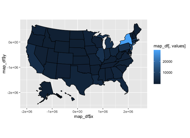
By using plot_map fuction, you can join the covid-19 data you cleaned
usmap::plot_usmap(data = covid_sum, values = "death_sum") +
  scale_fill_continuous() + #visualizing the date in gradient
  theme_grey() #R default theme
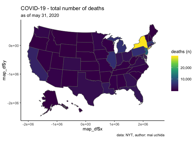
let’s make it more visually appealing!
#line color = grey
usmap::plot_usmap(data = covid_sum, values = "death_sum", color = "grey40") +

#chnage the gradient type, add comma on legend
  scale_fill_continuous(type='viridis', label = scales:: comma) +

#add title, subtitle, caption, and legend title
  labs(title = "COVID-19 - total number of deaths",
       subtitle = "as of may 31, 2020",
       caption = "data: NYT, author: mai uchida",
       fill = "deaths (n)") +

#set the theme to classic (my go-to theme!)
  theme_classic()
let’s clean up a bit more
#no changes from the previous code
usmap::plot_usmap(data = covid_sum, values = "death_sum", color = "grey40") +
  scale_fill_continuous(type='viridis', label = scales:: comma) +
  labs(title = "COVID-19 - total number of deaths",
       subtitle = "as of may 31, 2020",
       caption = "data: NYT, author: mai uchida",
       fill = "deaths (n)") +
  theme_classic()+

#remove unnecessary elements from the graphic-------------------------------

#remove background
  theme(panel.background=element_blank(),

#remove boarders
        panel.border=element_blank(),

#remove grid lines
        panel.grid.major=element_blank(),
        panel.grid.minor=element_blank(),

#change the legend position
        legend.position = "right",

#remove axis lines, tick marks, texts, and tile
        axis.line = element_blank(),
        axis.ticks = element_blank(),
        axis.text.x=element_blank(),
        axis.text.y=element_blank(),
        axis.title.x=element_blank(),
        axis.title.y=element_blank())
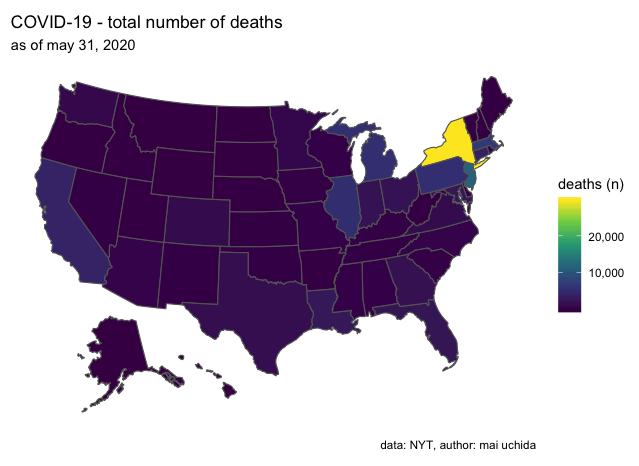
Voila! Now you know how to make a COVID-19 map in few lines of code!
final code here!
#####COVID-19 Map#####
##########06-02-20####

library(dplyr)
library(ggplot2)
library(tidyr)
library(tidyverse) #read_csv
library(lubridate)
library(usmap)
library(viridis)


#set and check your working directory
getwd()
setwd(/YOUR FILE PATH HERE/)

#load the dataset
covid <- read_csv("covid19_us-counties.csv")


#filter the covid data
covid_sum <- covid %>%
  filter(date == as.Date("2020-05-31")) %>%
  group_by(state) %>%
  summarise(death_sum = sum(deaths))

us_map <- usmap::us_map(region = "states")

#join data + visualize
usmap::plot_usmap(data = covid_sum, values = "death_sum", color = "grey40") +
  scale_fill_continuous(type='viridis', label = scales:: comma) +
  labs(title = "COVID-19 - total number of deaths",
       subtitle = "as of may 31, 2020",
       caption = "data: NYT, author: mai uchida",
       fill = "deaths (n)") +
  theme_classic()+
  theme(panel.background=element_blank(),
        panel.border=element_blank(),
        panel.grid.major=element_blank(),
        panel.grid.minor=element_blank(),
        legend.position = "right",
        axis.line = element_blank(),
        axis.ticks = element_blank(),
        axis.text.x=element_blank(),
        axis.text.y=element_blank(),
        axis.title.x=element_blank(),
        axis.title.y=element_blank())